Friday, 6 April 2012
Evaluation problems.
It seems that blogger has decided not to embed the whole of my evaluation, I am working on the as fast as I can to grab some more iWork space and fix the problem.
Edit: iWork is only beta and just under maintenance at the moment but the support teams are saying nothing has been lost and it should be automatically restored when the cloud goes back up.
Edit: iWork is only beta and just under maintenance at the moment but the support teams are saying nothing has been lost and it should be automatically restored when the cloud goes back up.
Evaluation
P.s. Navigate through clicking in the embed itself and click the arrow in the bottom right to go fullscreen.
Final Animation
This is the final Animation Piece, after running the drafts and previous tests past our peers and members of our target audience we have adressed every issue. However there are a few things which I would have liked to have been able to do differently which I shall adress in my evaluation.
Thursday, 5 April 2012
Final DVD cover
After showing our previous final draft to Jack (Hannah's nephew) and a few of his friends, all within our target audience and also discussing the design with a few of our peers we applied our final tweaks based on their reactions and comments. We filled in some of the 'white space' on the page and implemented our logo to reinforce our brand identity and brand recognition as I have mentioned previously. Overall we are happy with our final design and feel like it measures up to our specifications based on existing products.

Brand Identity
Brand identity is key to a successful business of any kind, one of the strongest examples is Coca Cola, a brand which I have previously studied. The logo and design of Coca Cola is so widespread and recognisable that Coca Cola even once put out an advert consisting purely of the red and white 'wave' that they were so confident on people recognising their brand, and it was a successful advert.
 Building a brand identity requires a consistant use of the same logos, characters, designs and themes, and re-branding a company is a risky move that can often backfire or have negative compact, for example in 2001 the Royal Mail rebranded themselves to 'Consignia' but quickly changed as it was so unpopular with both the public and the companies employees.


To link our products together and reinforce our brand identity, we will be repeating our logos, designs and characters throughout to make our brand recognition as strong as possible. For this reason it is important that our logo especially is suitable for all medias and purposes so it can be used in different places without having to alter it.

More information on Hannah's blog here.
Monday, 2 April 2012
Magazine Cover Final Product
After finishing our previous draft of the Magazine cover we took it to our teachers and discussed it, one of the main issues we ran into was the amount of 'white space' on it, a general lack of content in places where we thought we could fit more in. We also took the image to Hannah's nephew, who fits into our target audience and let him look at it and talked to him as best we could, we noticed that he didn't stay interested in it for as long as we would have hoped. All of these things point towards the need for content and things to look at. So we added in some more features on the image and we now feel better about it. After again showing it to Hannah's nephew we noticed a significant increase in his attention to it and how entertained he was by the pictures and activities.

Wednesday, 15 February 2012
More detail into Exhibition and Distribution
Good exhibition and distribution is monumentally important for a successful product so it is a subject which me and Hannah researched into and have to make decisions about:
The Broadcasters' Audience Research Board (BARB) have the average weekly viewing time per person (in the UK) for some various children's channels we could potentially be shown on.
The viewings are as follows:
•Tiny Pop - 1 minute
•Cartoonito - 3 minutes
•Nick Jr - 5 minutes
•Disney Junior - 6 minutes
•Cbeebies - 22 minutes
As it shows, Cbeebies would be the best channel for us in terms of potentially receiving most viewers. (So this would be the channel we would approach to have our programme on.
The main place which children visit with an adult which sell DVD's would be a supermarket. And again, placing the product at eye-level would increase the chances of the child seeing it and subsequently wanting it. Also, DVDs are regularly advertised on television. So having a good marketing and advertising campaign for the DVD will be important. Also, with the increase of people using online shops such as Amazon etc, selling our product here would be another effective way.
Newsagents and Supermarkets would be the best choice as we believe as this is where child's magazine's tend to be sold currently, and also where children tend to accompany their parents in shopping. If we placed the magazine at child's eye level they would be more likely to see and recognise the programme. Also, if we include a free gift on the magazine it increases the child's want for it as they would receive free exciting toys.
For Hannah's post on this subject, along with some information on potential exhibition and distribution companies click here
OTS
The first and most obvious step is to limit our exhibition to child-specific channels such as Nick Jr, Cbeebies etc therefore receive views from within our age range for target audience. We would introduce our new TV programme by having it on channels and along side existing programmes and channels with an existing view base.The Broadcasters' Audience Research Board (BARB) have the average weekly viewing time per person (in the UK) for some various children's channels we could potentially be shown on.
The viewings are as follows:
•Tiny Pop - 1 minute
•Cartoonito - 3 minutes
•Nick Jr - 5 minutes
•Disney Junior - 6 minutes
•Cbeebies - 22 minutes
As it shows, Cbeebies would be the best channel for us in terms of potentially receiving most viewers. (So this would be the channel we would approach to have our programme on.
The DVD
The main place which children visit with an adult which sell DVD's would be a supermarket. And again, placing the product at eye-level would increase the chances of the child seeing it and subsequently wanting it. Also, DVDs are regularly advertised on television. So having a good marketing and advertising campaign for the DVD will be important. Also, with the increase of people using online shops such as Amazon etc, selling our product here would be another effective way.
The magazine
Newsagents and Supermarkets would be the best choice as we believe as this is where child's magazine's tend to be sold currently, and also where children tend to accompany their parents in shopping. If we placed the magazine at child's eye level they would be more likely to see and recognise the programme. Also, if we include a free gift on the magazine it increases the child's want for it as they would receive free exciting toys.
For Hannah's post on this subject, along with some information on potential exhibition and distribution companies click here
Wednesday, 8 February 2012
Animating Screen Recordings
These are some screen recordings of me creating our animation. At a later date I will do a talk through in detail of some of the techniques I used and how I achieved them.
Tuesday, 7 February 2012
Magazine Cover Final Draft


'Peppa Pig' is a brand that shares many aspects with our product including style and target audience. These are some existing 'Peppa Pig' magazine covers that we used to influence and inspire our design.
Monday, 6 February 2012
Deconstruction of existing product

The Title Logo; It is placed, as is conventional in the top centre of the magazine taking up roughly a quater of the height of the piece.
Colour patches; Colour patches of a set theme and style create the boundaries and dividers on the page. We liked this design feature and plan to use it in our own.
Additional Toy placement; One of the issues we talked about within our focus groups was the placement of the toy and wether it conflicted with any part of the design on the page. As with this example we decided to not let the external toy interfere with the design of the page.
Footer; From this example we took influences for the size and design of the footer in our design. Although we did feel that on this specific example it takes up marginally more space than we felt necessary.
Activity fluff; The advertising of activities that are inside are a main component for using the space in most magazine designs and is something we must include in our own design.
Friday, 3 February 2012
HannahCousinsA2Media: Narrator's voice
HannahCousinsA2Media: Narrator's voice: So, for our OTS, we need a narrator to introduce the characters briefly. Looking at some other children's tv programme narrators, they all ...
Wednesday, 1 February 2012
DVD Cover Final Draft

Monday, 30 January 2012
Existing DVD cover deconstruction

As we can see in this design it shares a lot of very similar repeated components that are consistant throughout the brand for brand recognition (logo, character, background, font). This is a strong feature that we will make sure to include in our final piece. The design is also very simple as the main bulk of information text would be on the back of the DVD case, this means that it is a very minimalistic and allows each individual component to stand out.
Saturday, 28 January 2012
Drawing Development - Finals
These are the updated and coloured images that we will use in our animation. The white areas on most of these images will be cleared so that when I distribute them to individual layers, the layers underneath will be visible.


Thursday, 26 January 2012
Hierarchy
The 'Hierarchy' of a design is the placement as size of different components within the design, these factors effect the focus of a design and importance of individual components and features. For example; in almost every design within the DVD and Magazine industry the Title Logo will be one of the largest components as it is extremely important for brand identity and brand recognition. Another example is the price, in most situations the price label will be one of the smallest components to draw attention away from the money aspect of the product.

Monday, 23 January 2012
Drawing Drafts
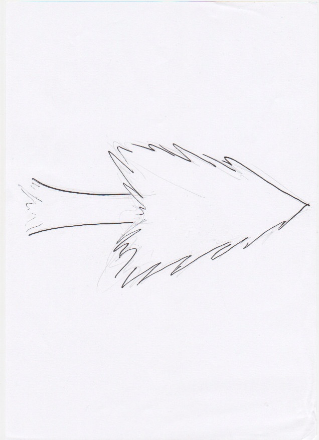


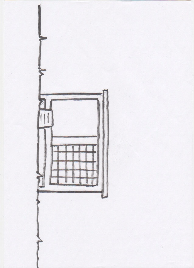
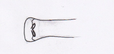

These are some of the original sketches that preceded our final images, we drew them in pencil by hand, then traced them with a darker pen so that the scanner could pick it up more clearly. As we have talked about before in previous posts we want our scenery to simplistic and stylised, some of it with a 'partially rendered' effect. Colouring the images digitally in Photoshop rather than by hand gave us much more freedom with colours and unlimited attempts at getting it right.
Sunday, 22 January 2012
Teaching Hannah Flash
In this video I am teaching Hannah the very very basics of our animation and how it works, this means that she can help me with constructing the final animation. We created a very very basic movement of one of his body parts, and I explain to her how our full animation is just a complex compilation of many of these simple movements.
Friday, 20 January 2012
Animation test
This is our first animation test using all of the graphics such as the background in one scene. The animation sequences and tweens are very basic and in the final animation they will be alot more detailed. As a whole, on the technical side of things (export quality, resolution etc) we are happy with the outcome.
Thursday, 12 January 2012
Flash Problems 1
I mentioned in previous posts that I was using flash and was also having some troubles getting it to do exactly what I wanted. To clear things up I'll explain what it is exactly that I'm trying to do, and whats going wrong.
The objective is to have individual body parts within flash that I can move and tween to create a moving image. I have all the individual parts drawn out in Adobe Illustrator and importing them to flash seems not to be a problem although there are a lot of different options when it comes to animating images in flash (bitmap, imported, symbol etc) and as I don't know the technical difference between the options I'm using trial and error to find which one works. For example to make sure certain parts rotate correctly from the correct angle (e.g. arms rotating from the end rather than the center), a point on an image in flash called the 'transformation point' controls where the image scales and rotates from, unfortunatley im having problems permanently changing the location of this point on the parts I import.
The objective is to have individual body parts within flash that I can move and tween to create a moving image. I have all the individual parts drawn out in Adobe Illustrator and importing them to flash seems not to be a problem although there are a lot of different options when it comes to animating images in flash (bitmap, imported, symbol etc) and as I don't know the technical difference between the options I'm using trial and error to find which one works. For example to make sure certain parts rotate correctly from the correct angle (e.g. arms rotating from the end rather than the center), a point on an image in flash called the 'transformation point' controls where the image scales and rotates from, unfortunatley im having problems permanently changing the location of this point on the parts I import.
Tuesday, 10 January 2012
Images
Today me and Hannah have worked on creating some images that we will use in the final animation such as sprites and backgrounds. We first sketched them out by hand then outlined them with a thicker, darker pen so that the scanner could pick them up easier. We then scanned them into the computer and edited and coloured them to fit our scheme and ideas.

 We did this progress for multiple parts including Hazel's tree, Barnaby's Hutch and Barnaby's water bottle amongst others. The next step with these parts is to get them into the animation stage.
I also started crating a test animation for our second character 'Hazel', starting by dissembling her original picture into workable body parts. Flash is definitely the tool I want to use as it has everything we want to achieve under a seemingly simple system, unfortunately parts of the programme are proving to be frustratingly difficult but I am managing to work around or figure out all of the problems so far.


I also started crating a test animation for our second character 'Hazel', starting by dissembling her original picture into workable body parts. Flash is definitely the tool I want to use as it has everything we want to achieve under a seemingly simple system, unfortunately parts of the programme are proving to be frustratingly difficult but I am managing to work around or figure out all of the problems so far.

Subscribe to:
Posts (Atom)